by Joe Printer | Oct 20, 2026 | Blog
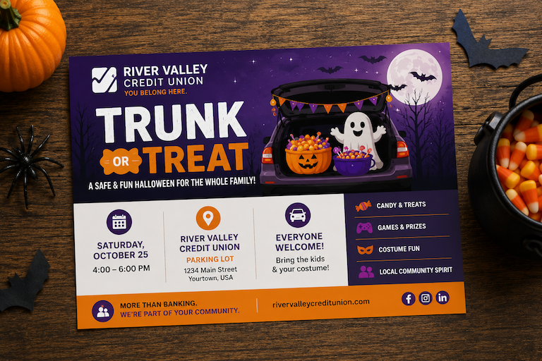
Your handout shouldn’t make customers work for the message. But that happens more often than you might think. Tiny type, crowded layouts, weak contrast, and blurry images can turn a useful piece into something people skim once and set aside. That’s the spooky part....
by Joe Printer | Oct 16, 2026 | Blog
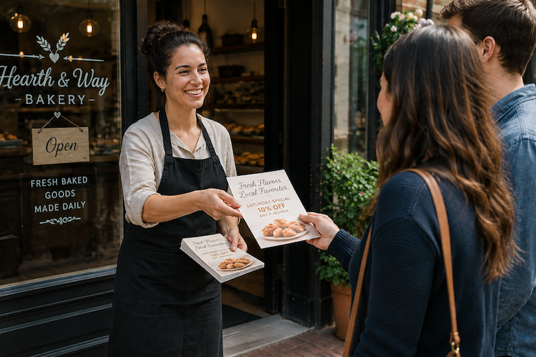
A print idea doesn’t need a huge audience to be worth doing. In fact, some projects are better because the quantity stays small. You can tailor the message, update it sooner, test something new, or create a piece for one specific opportunity without worrying about a...

by Joe Printer | Oct 13, 2026 | Blog
A flyer that gets printed and distributed this week has a chance to work. The elaborate marketing piece still circling through another round of revisions doesn’t. It’s easy for a simple print project to grow into something much bigger than it needs to be. More copy...

by Joe Printer | Oct 9, 2026 | Blog
Not every marketing win starts with a major campaign. Sometimes the most useful piece is also the simplest: something your customers can pick up, keep, refer to, or act on right away. That might be a flyer for an event, a fresh menu, a one-page sales handout, or a...
by Joe Printer | Oct 6, 2026 | Blog
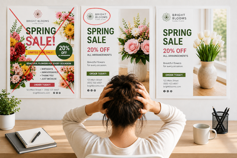
You’ve changed the headline three times. Moved the logo. Moved it back. Tried another photo. Compared six shades of blue. Now you’re wondering whether the whole thing needs to be redesigned. When a flyer, postcard, handout, or other marketing piece represents your...
by Joe Printer | Oct 2, 2026 | Blog
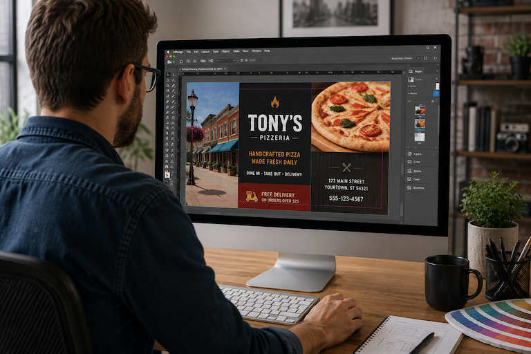
Your flyer looks sharp on screen. The colors are bright, the photos are clear, and the headline stands out. Then you print it, and something feels different. That gap between screen and paper is behind several common print design mistakes. Fortunately, you don’t need...